tl;dr - desiging IRL posters to promote myself was a fun letdown.
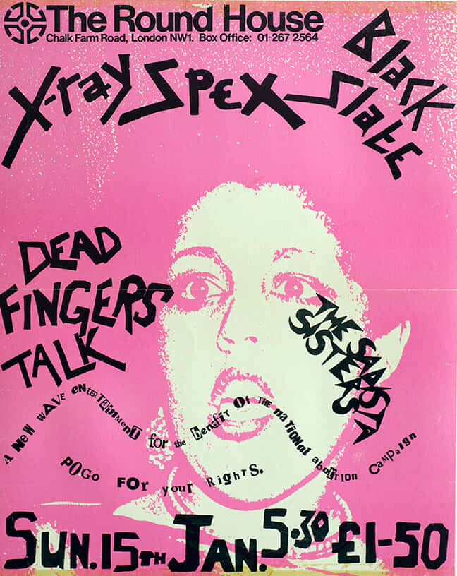
To let the world know I build killer sites, I landed on wheatpasting some posters downtown as a fun way to advertise my businesses. The goal was to stand out with some engaging colors and punk compositions, so I started by gathering inspiration from old Thrasher magazine covers and band posters.


While my style was brewing I landed on language that would compliment the counter-culture direction - none of that try hard "desperate for business" bologna. I wanted to capitalize on the fact that lots of websites look like babboon ass, with taglines like "your site sucks".
Does your site suck? Hit me up
They came out pretty well and I was happy with the results. Until, like with any art project, I knew I'd revisit it the next day and see everything that's wrong with it. So after a few tweaks and some patience, I finally landed on the final designs. Or so I thought..
As a web developer I work mostly in the RGB (red, green, blue) color model - so that's the model I designed my posters in. A novice mistake any printer would throw their head back and laugh at, because RGB isn't supported by printing machines. Printing machines use CMYK (cyan, magenta, yellow, black).
So here I go uploading my work to a printing service only to find the colors muted and misrepresented. Apparently RGB displays are able to display colors that don't exist naturally because the colors are being emitted, not reflected. One of those "gotcha" moments I'm plenty familiar with after building a career on javascript frameworks (its too late for me, don't make the same mistake).
The difference between the RGB and CMYK model is painfully obvious:


So back to photoshop (illustrator enjoyers seeth) to correct all my mistakes and wrestle with the fact that my posters just aren't going to pop like I thought they would. My slime green is now booger green and my hot pinks are luke warm, awesome. But every programmer eventually develops the patience of a saint to cope with learning from their mistakes over and over again, and so I trudged forward.
Compromises were made and eventually I was, once again, happy with the outcome (albiet relunctantly so). Take a look, take a gander, and know this: never design print materials in the RGB color model. So long, suckers.
